The Principle of Proportional Ink
In this article we explore a basic rule for the design of data graphics, the principle of proportional ink. The rule is very simple: when a shaded region is used to represent a numerical value, the area of that shaded region should be directly proportional to the corresponding value. In other words, the amount of ink used to indicate a value should be proportional to the value itself.
This rule derives from a more general principle that Edward Tufte set out in his classic book The Visual Display of Quantitative Information. There, he argues that "The representation of numbers, as physically measured on the surface of the graphic itself, should be directly proportional to the numerical quantities represented." (1983, p.56)
The principle of proportional ink makes sense of, and extends, the arguments in our article about misleading axes. There we railed against bar charts featuring bars that fail to reach zero, yet we suggested that the axes for line charts need not include zero; rather these should be scaled so as best bring out the trends in the data. Why the apparent double standard?
Bar charts
We can see right away that the principle of proportional ink is violated by bar charts with axes that fail to reach zero. As an example the bar chart below, from the Tennessee Department of Labor and Workforce Development, illustrates the change over time in non-farm jobs in the state of Tennessee.
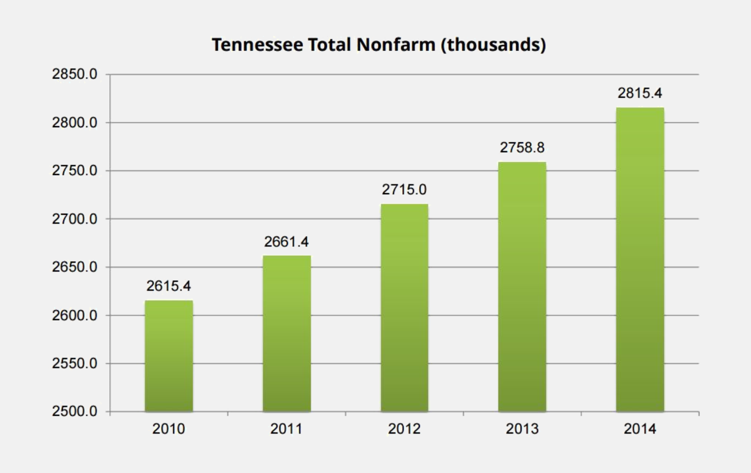
In this chart the value for 2014 is approximately 1.08 times the value for 2010, but because the vertical axis has been truncated, the bar for 2014 uses approximately 2.7 times as much ink as the bar for 2010. This is not proportional ink!
Bar graphs can be mislead in the opposite direction as well, concealing differences instead of exaggerating them. The bar graph below, from Business Insider, is designed around the visual conceit of indicating the book's title by drawing the book as a part of the bar graph. Let's ignore the fact that the legend indicates that these are the most read books whereas the fine print indicates that they are instead the most sold.
The visual problem with this graph is that the portion of each bar used to display the title of each book is situated entirely below zero! As a result, the bars for The Diary of Anne Frank and for The Da Vinci Code differ in height by only a fraction of a percent, despite the fact that the latter has sold more than twice as many copies as the former.
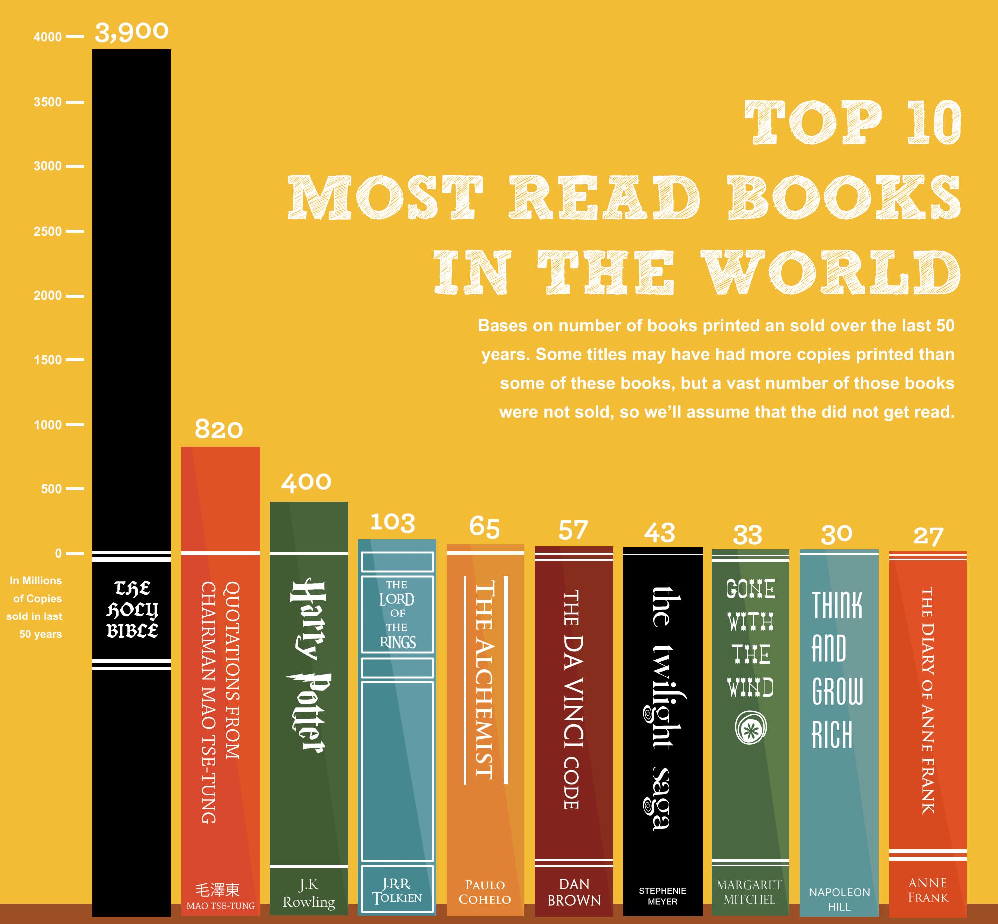
(And what on earth was the designer thinking when incorporating the extra horizontal lines immediately adjacent to the zero line on many of the books?)
As a final note, readers who are deeply interested in applying the principle of proportional ink to bar graphs may also wish to think about what this principle suggests for the use of logarithmic scales. In doing so we go way down the rabbit hole and thus we have moved this discussion to a separate page.
Line graphs
In our article about misleading axes, we argued that unlike bar charts, line graphs need not include zero on the dependent variable axis. Why not? The answer is that line charts don't use shaded volumes to indicate quantities; rather, they use positions that indicate quantities. The principle of proportional ink therefore does not apply, because the amount of ink is not used to indicate the magnitude of a variable. Instead, a line chart should be scaled so as to make the position of each point maximally informative, usually by allowing the axis to span the region not much larger than the range of the data values.
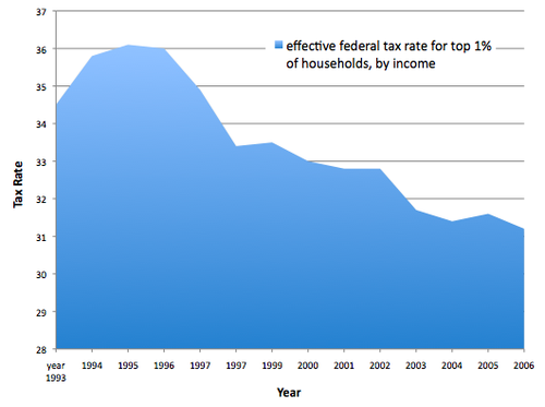
That said, a "filled" line chart does use shaded areas to represent values and should have an axis that goes to zero. The example below, from The Atlantic, is misleading in this way. Because the vertical axis is cut off at 28%, the decline in tax rates appears more substantial than it actually has been. If the area below the curve were left unfilled, this would not be an issue.
Bubble charts
Graphs known as bubble charts have become popular in recent years, due in considerable part to the efforts of the late Hans Rosling. We are of two minds about these diagrams. The power of the bubble chart is that by using color and size as well as vertical and horizontal position, one can simultaneously encode four different attributes for each item in the dataset. Moreover, these graphs can be pure magic when they are animated and then presented by Rosling himself (below).
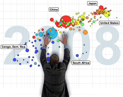
The problem with bubble charts (other than the fact that we cannot ourselves present them with anything like Rosling's brilliance and energy) is that only the vertical and horizontal positions allow easy and precise comparisons. Color and size are useful to set context for each item. For example, in the graph below the size of each disk is proportional to the population size of the country it represents. This allows us to weight larger countries more heavily when mentally fitting a curve through the points. That's sufficient in this particular case. It's not important to know whether India (the leftmost of the two large red disks) is more or less populous than China (the rightmost of the two large red disks); one only needs to know that both countries are very large.
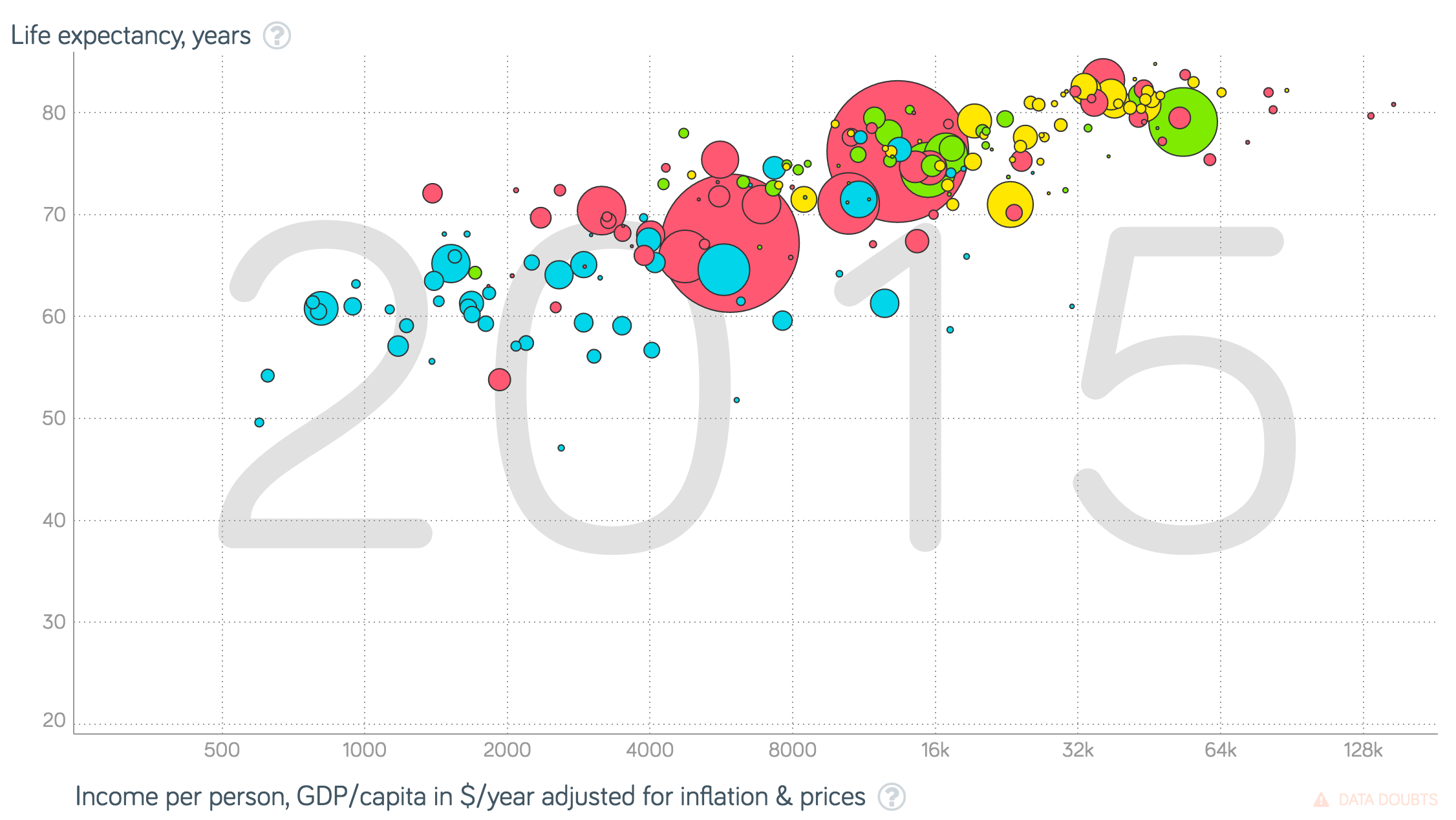
All too often, however, we see bubble charts where one wishes to make precise comparisons among the values indicated by the disk sizes, and that is very difficult to do. In the diagram above can you tell at a glance whether India is larger or smaller than China ? And if so, can you tell by how much they differ? (In fact, India is about 5% smaller). This would be much easier to discern from a bar chart.
In the Gapminder chart above, the area of each disk is proportional to the value indicated by size. According to the principle of proportional ink, this is the correct approach. A country twice as large uses twice the amount of ink. Unfortunately, psychophysical studies reveal that most people underestimate the difference in area of two disks. (This problem does not arise for lengths or even for the areas of rectangles). Some authors have argued that we should violate the principle of proportional ink to compensate for this bias in human perception. We don't agree, but we are hard-pressed to argue that our view is much more than a dogmatic opinion.
Unfortunately, we sometimes see bubble charts that go far beyond what any psychophysical study would justify, making the radius of the disk proportional to the value that disk represents. One such example is below.
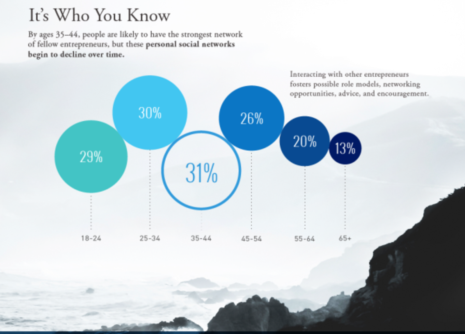
In this bubble chart, the disk representing people aged 45-54 years olds has a value of 26%, whereas the disk representing those aged 65+ has a value of one-half of that, 13%. According to the principle of proportional ink, the 65+ disk should have one half the area of the 45-54 disk. But in this diagram, the 65+ disk has one half the radius and thus one fourth the area. In other words, by representing the percentage value with the radius rather than the area of the disk, this graph visually exaggerates the differences between the groups represented by each bubble.
Notice moreover that this graph squanders the very opportunity that can make a bubble chart worthwhile: the opportunity to use the disks' vertical and horizontal positions (and colors) to convey multidimensional information. The only information in this entire chart is contained in the sizes of the disks, and these are misleading. While we're at it, even that information is of questionable value. Looking at the graph or examining the full-sized original infographic and the associated blog post, we can't figure out what these percentages refer to. Can you?
To be fair, this graphic does one important thing right: it displays the numerical values associated with each disk. This serves as a partial check upon the misleading way that size scales with value.
Donut bar charts
Fortunately, the so-called donut bar chart is relatively rare in the world of data visualization. Still, we consider this genre here as it provides a particularly striking illustration of how a graph can exaggerate differences by violating the principle of proportional ink. The image below purports to illustrate differences in arable land per capita.

The problem with this type of visualization is that the geometry of the circle assigns a disproportionate amount of ink to bars further on the outside. We can estimate the degree to which such a graph deviates from the use of proportional ink. Take a curved band representing one value in the chart. If φ is the central angle associated with this band, r is the distance of between the center of the diagram and the center of the band, and w is the width of the band, the length of the band is φr and its area is approximately φrw. For example, the central angle of the band representing the US is approximately 75 degrees, and the central angle of the band representing Canada is approximately three times as large. The distance of the US band from the center of the diagram is approximately half the distance of the Canadian band. The widths of the two bands are the same. Thus while US value is one third that of the Canadian value, the US band uses only sixth the ink of its Canadian counterpart.
A donut bar chart can exaggerate or conceal the differences between values, depending on how it is designed. When the bands are ordered from smallest in the center to largest at the periphery, as in the chart shown above, the amount of ink used for each band exaggerates the differences. If instead the bands were ordered from largest in the center to smallest at the periphery, the amount of ink used would play down the differences between values.
A changing denominator
Let's consider a more subtle example. The visualization below, which appeared in a Time Magazine article, illustrates the most common causes of death, by age group. It is notable for the large amount of complex information that it packs into a single figure.
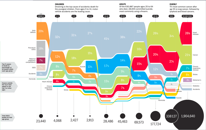
Looking vertically along any column, across mortality causes for one particular age, the graph indeed uses proportional ink. The height of each shaded block corresponds to the fraction of total deaths from the associated cause. We see this in the diagram below.
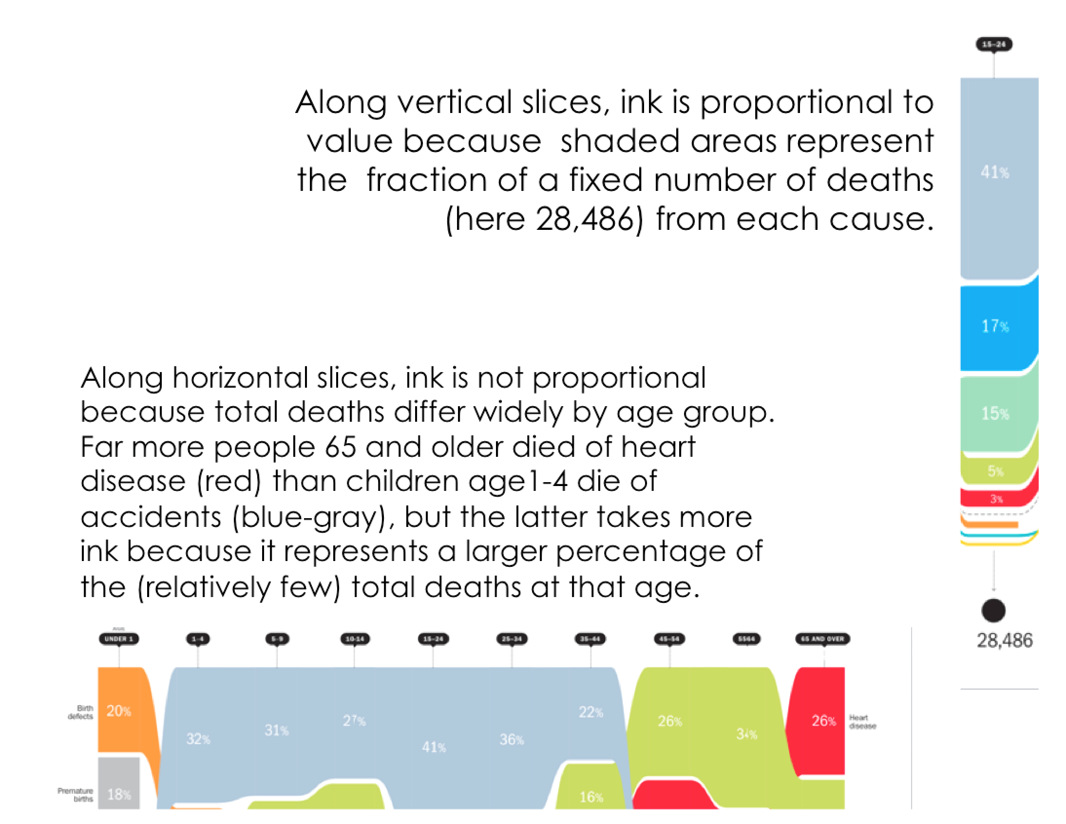
If we move horizontally, among age groups, the total number of deaths for each age group changes. But in the graph, ink is used to represent the fraction of deaths, not the total number of deaths. As a result, it is easy to draw misleading conclusions from the graph. For example, look at the blue-gray bars representing deaths due to accidents. Comparing the massive blue-gray region for ages 1-4 to the tiny sliver for ages 65-and-older, one might surmise that accidents pose a far more grave risk to toddlers than to the elderly. Not so! The chance of dying due to accident is actually much higher for the elderly than for toddlers, but this source of mortality is swamped by the even more exaggerated chance of dying due to heart disease, cancer, and other maladies that only very rarely affect children.
The design of this graph is neither devious nor inept. Within-age comparisons are entirely unproblematic. But for between-age comparisons, the shifting denominator — the number of total deaths in each age group — obscures the true risks associated with different causes of death. Indeed, we have not been able to envision an alternative design that has all of the benefits but none of the problems associated with the design here. In this case, some of the burden may genuinely lie on the reader not to make mistakes of interpretation.
Three dimensions
In the late 1980s, a number of graphics software packages began to produce 3-D bar charts. By the 1990s, the ability to create 3D bar charts was ubiquitous across data graphics packages, and these charts began to appear in venues ranging from corporate prospectuses to scientific papers to college recruiting brochures.
To be sure, 3D bar charts can serve a legitimate purpose when they are used to display values associated with a pair of independent variables, as in the 1996 example below.
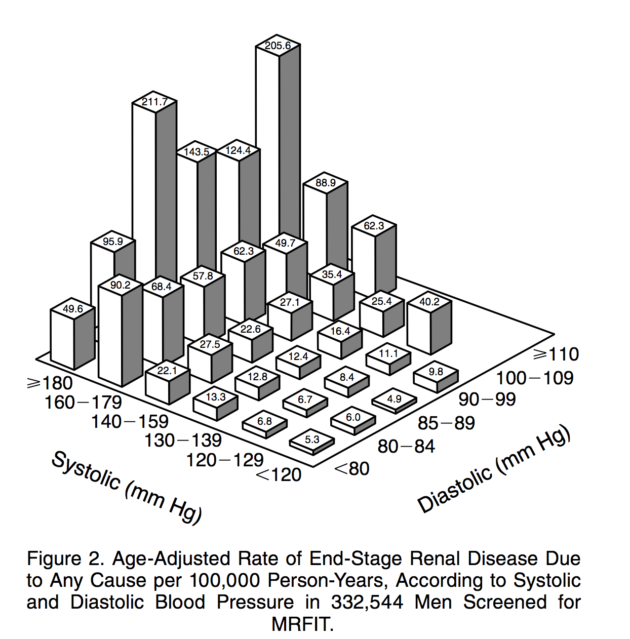
The graph above is not particularly attractive, and it suffers from a few issues that we'll discuss shortly, but it serves the purpose of organizing a two-dimensional matrix of values. Indeed, the alternative — a heatmap — is also problematic because quantitative values are not well encoded by color. Readers have great difficulty in cognitively mapping color differences to differences in numeric values, and moreover the magnitudes of perceived differences depend on the choice of palette.
Where 3D bar charts move into straight-up bull territory is when they are used to represent data with only one independent variable. In these cases, a 2D bar graph would serve the purpose much better.
For such graphs the designer adds no meaningful information by moving from 2D to 3D. The graphs are actually made harder to interpret, because 3D bar charts violate the principle of proportional ink in several ways. As best as we can tell, the entire point of using the third dimension in these cases seems to be to impress the viewer. In the 1990s, the aim was often to show off what at the time was a fancy new 3D technology. Two decades later, it is unclear quite why designers continue to use these graphs. Perhaps they think the third dimension looks more attractive somehow, or perhaps 3D graphs became associated with ``professionalism'' during the 1990s and we've yet to shake the association.
Why exactly are 3D bar charts harder to interpret than their 2D equivalents? Let's consider a relatively innocuous example:
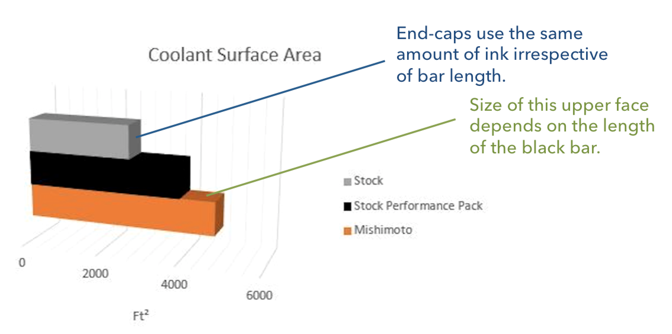
This graph violates the principle of proportional ink. How? First, the end-caps extend the effective visual length of each bar. This violates the principle of proportional ink because every bar has the same amount ink used for its end-cap, irrespective of its size. Second, the angle at which the graph is arrayed can make it difficult to assess the lengths of the bars. How much easier would it be to see the exact values if the graph were shown from head-on? Third, when the bars are stacked atop or in front of one another, as in the image above, the sides of some bars are fully visible and the sides of others are partially obscured. Again, this is a violation of the principle of proportional ink. In the graph above, the amount of orange ink used depends not only on the length of the orange bar, but also on the length of the black bar that partially obscures it.
Perspective
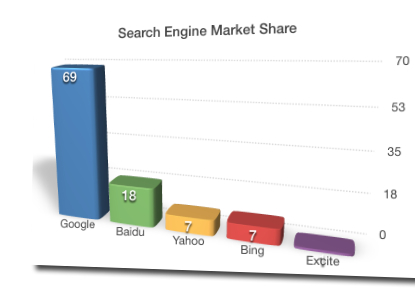
Another serious deficit of 3D graphs is that the use of perspective makes it substantially harder for a viewer to assess the relative sizes of the chart elements, and often violates the principle of proportional ink. This effect is subtle in the coolant surface area graph above, but is highly conspicuous in the search engine market share graph below. In the graph below, it is clear that the horizontal gridlines are not parallel but rather recede toward a vanishing point off the left side of the graph. As a result, bars toward the left are shorter, and use less ink, than equivalently valued bars toward the right. Again, this is pure visual bull: meaning is obscured without adding any additional information, simply in order to impress the viewer.
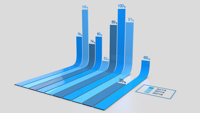
Foreshortening, in which objects along the line of sight appear shorter than those perpendicular to the line of sight, is a consequence of perspective drawing. So long as all chart elements are parallel, as in an ordinary bar graph, each is foreshortened to the same degree and thus this is not a serious problem. When chart elements curve, however, they can be foreshortened in different ways. In the atrocious curved 3D bar chart below, the vertical component of each bar is essentially not foreshortened, but the horizontal region is foreshortened, violating the principle of proportional ink. Because the eye tends to focus on only the vertical region of the chart, there is also a visual effect akin to starting the graph at a non-zero value.
Pie charts
The main purpose of using a pie chart, rather than a bar graph, is to visually indicate that a set of values are fractions or percentages that add up to a whole. This message comes at a considerable cost: comparing values is more difficult with a piece chart than with a bar chart. Even when represented in two dimensions, pie charts are problematic because relative areas are difficult to assess visually in angular form.
Three dimensional pie charts, such as the one below, are even worse. We cannot think of a situation in which the addition of a third dimension offers anything other than visual bull.
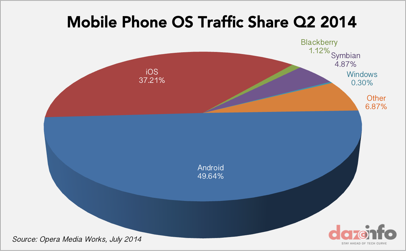
The main problem with 3D pie charts that in these graphics, the front-most wedges of the pie chart to appear to be larger than the rear wedges. There are two reasons. First, the viewer sees the front edge but the not back edge of the pie chart. Second, if the chart is displayed using perspective, the upper surface of a wedge in the front of the pie will be greater than the upper surface of a rear wedge spanning the same angle. Both effects violate the principle of proportional link. In the image above, the Android wedge is supposed to represent less than 50% of the total, but 70% of the pixels (or ink, were it on paper) are used to depict this one wedge. Even if we ignore the vertical edge of the disk, the upper surface of the Android wedge still represents 60% of the total ink use for the surface of the pie rather than the 50% that proportional ink would demand.
Conclusion
Many forms of data visualization use shaded areas to represent data values. To avoid misleading viewers, it is imperative in these types of graphs that the sizes of the shaded areas are directly proportional to the magnitudes of the values being indicated. This is what we have called the principle of proportional ink. Unfortunately, we have seen that this principle is readily violated in a number of ways. As you assess data graphics, be on the lookout for such violations. And when you create your own visualizations, don't bull your audience. Design carefully to avoid violating this principle yourself.