Proportional Ink and Logarithmic Scales
In the main article on the Principle of Proportional Ink we noted that the principle has interesting implications for the use of logarithmic scales. This issue goes a bit too far down the rabbit hole for most readers, so we've relegated our discussion of the issue to this aside
In general, we have no problem with the use of log- or semi-log graphs in scientific papers, though we recommend against them for most popular media venues simply because one needs a bit of practice to interpret these graphs readily. But the principle of proportional ink demands that rather than graphing the actual values on a log scale, we should graphs the log values on a linear scale. Only in the latter case are we using ink in proportional to the quantity being illustrated.
We have violated this dictate in our own work. In a paper on gender and self-citation, we presented the following graph illustrating the number of papers in the JSTOR database that contain n self-citations.
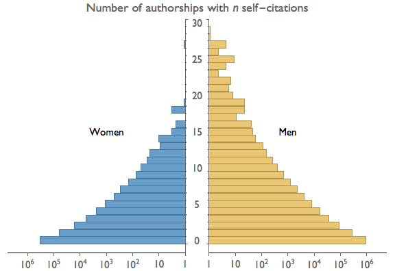
In the figure above we have graphed the values on a logarithmic scale, such that each additional one-unit increment of ink corresponds to a ten-fold increase in value. That's not proportional! If instead we graph the logs of the values, each additional increment of ink corresponds to one log unit, which is proportional. The graph would then look as below.

We are not sure that this is much of a solution. Technically the principle of proportional ink is now maintained, but it's really a technicality. We haven't changed the form of the image at all. We have merely changed the labels so that we are now graphing an unintuitive quantity (logs) on an intuitive scale (linear), rather than graphing an intuitive quantity (actual value) on a less intuitive scale (logrithmic). Worse still, we've changed the axis labels in a way that opens up the graph to be easily misinterpreted. If in the revised graph the reader misses the word "Log" in the graph title, he or she will get a completely wrong idea of the scaling. In the original graph, the powers-of-ten horizontal axis labels are difficult to miss and make the logarithmic scale abundantly clear.
In conclusion, we're of two minds about this case. On one hand, there's an appeal to taking a hard-line position regarding the principle of proportional ink. On the other, we should not let this principle get in the way of effective communication, let alone allow it to cause misunderstandings. Though it pains us, we lean toward using the original graph in violation of the principle, rather than using the revised graph that respects it.