Misleading axes on graphs
The purpose of a publication-stage data visualization is to tell a story. Subtle choices on the part of the author about how to represent a dataset graphically can have a substantial influence on the story that a visualization tells. Good visualization can bring out important aspects of data, but visualization can also be used to conceal or mislead. In this discussion, we'll look at some of the subtleties surrounding the seemingly straightforward issue of how to choose the range and scale for the axes of a graph.
Bar chart axes should include zero
We begin with a well-known issue: drawing bar charts with a measurement (dependent variable) axis that does not go to zero. The bar chart was created by the German economic development agency GTAI, and comes from a webpage about the German labor market. In the accompanying text, the agency boasts that German workers are more motivated and work more hours than do workers in other EU nations.
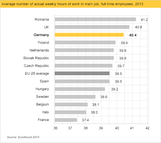
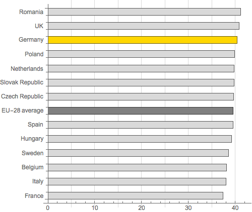
It looks like Germany has a big edge over other nations such as Sweden, let alone France, right? No. The size of this gap is an illusion. The graph is misleading because the horizontal axis representing working hours does not go to zero, but rather cuts off at 36. Below, we've redrawn the graph with an axis going all the way to zero. Now the differences between countries seem negligible.
(You might notice that in the redrawn graph we've removed the horizontal gridlines separating the countries. These were not particularly misleading, but they add visual clutter without serving any purpose whatsoever.)
Line graph axes need not include zero
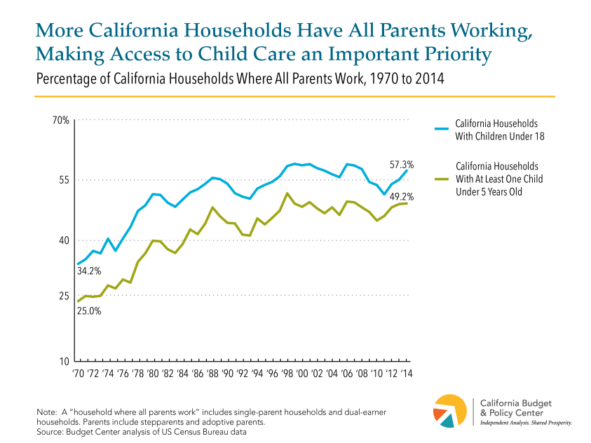
While the bars in a bar chart should (almost) always extend to zero, a line graph does not need to include zero on the dependent variable axis. For example, we consider the line graph below from the California Budget and Policy Center to be perfectly fine, despite the fact that the y-axis does not include zero.
What is the difference? Why does a bar graph need to include 0 on the dependent axis whereas a line graph need not do so? Our view is that the two types of graphs are telling different stories. By its design bar graph emphasizes the absolute magnitude of values associated with each category, whereas a line graph emphasizes the change in the dependent variable (usually the y value) as the independent variable (usually the x value) changes.
For a bar graph to provide a representative impression of the values being plotted, the visual weight of each bar — the amount of ink on the page, if you will — must be proportional to the value of that bar. Setting the axis above zero interferes with this. For example, if we create a bar graph with values 15 and 20 but set the axis at 10, the bar corresponding to 20 has twice the visual weight of the bar corresponding to 15, despite the value 20 being only 4/3 of the value 15.
A line graph doesn't draw the attention to the absolute magnitudes of the values, because there is little visual density — i.e., ink — below the curve being plotted. (The exception is line graph in which the area under the curve is filled; we believe these line graphs need to have a zero axis in the vast majority of cases.) As a result, the line graph is freed from the constraint of including 0 as the axis, and thus can zoom into the relevant range to better reveal changes in the dependent variable as the independent variable changes. Thus while people may gripe about line graphs that don't include zero on the dependent axis, we are unconcerned by this display decision. To reduce any opportunity for confusion, we are fans of a recent suggestion: line graphs that do not include zero should include a generous proportion of white space between the lowest point shown and the x-axis.
When line graphs ought not include zero
Indeed, line graphs can obscure important patterns if their axes that do go to zero. One notorious example, reproduced below, was created by bloggers at Powerline and was widely shared after it was tweeted by the National Review in late 2015.
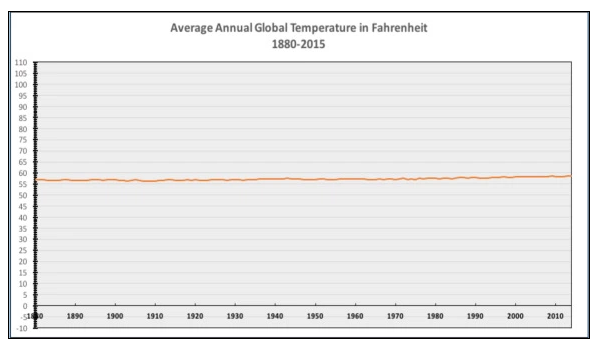
Philip Bump does a nice job of taking this graph apart in a Washington Post article. He points out that the purpose of considering climate change, the proper representation of these data would look something like the following:
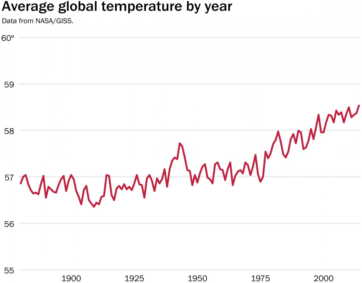
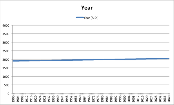
Bloomberg's Business Week opted for direct (and devastating) satire, plotting year A.D. on the y-axis against very same quantity on the x-axis, and by suitable choice of scales revealing a line as flat as that which the National Review obtained for climate data.
So clearly it was inappropriate for Powerline to plot the data as they did. What if they had instead used a bar graph or filled line graph, one might ask? Then according to the rules described earlier, including zero on the y-axis would have been the proper thing to do, right?
Well, not really. A bar graph or filled line graph of the same data would tell a different story. It would highlight not the changes in temperature, but rather the absolute magnitude of earthly temperatures. It wouldn't be useful for an earth-bound politician trying to make decisions about global warming; it would be something that, for example, an alien might want to know when deciding whether to land on Venus, Earth, or Mars.
The disingenuous aspect of the Powerline graph is not that temperature data should be displayed as line graphs with a non-zero y-axis or as anything else, it is that they made graphical display choices that are inconsistent with the story they are telling. The story that Powerline aims to tell is about the change (or lack thereof) in temperatures on Earth, but instead of choosing a plot designed to reveal change, they chose one designed to obscure it in favor of information about absolute magnitudes.
All of this is particularly silly given that everyday temperatures are interval variables specified on scales with arbitrary zero points. Zero degrees Celsius corresponds not to any universal physical property, but rather to the happenstance of the freezing temperature of water. The zero point on the Fahrenheit scale is even more arbitrary. If one actually wanted to argue that a temperature axis should include zero, temperature would have to be measured as a ratio variable, i.e., on a scale with a meaningful zero point. For example, you could use the Kelvin scale, for which absolute zero has a real physical meaning independent of human cultural conventions.
Multiple axes on a single graph
One can create yet more deceptive graphs if one is willing to compare multiple data series on the graph, with different scales for each series. The extraordinary graph below purports to illustrate a temporal correlation between thyroid cancer and the use of glyphosate (Roundup).
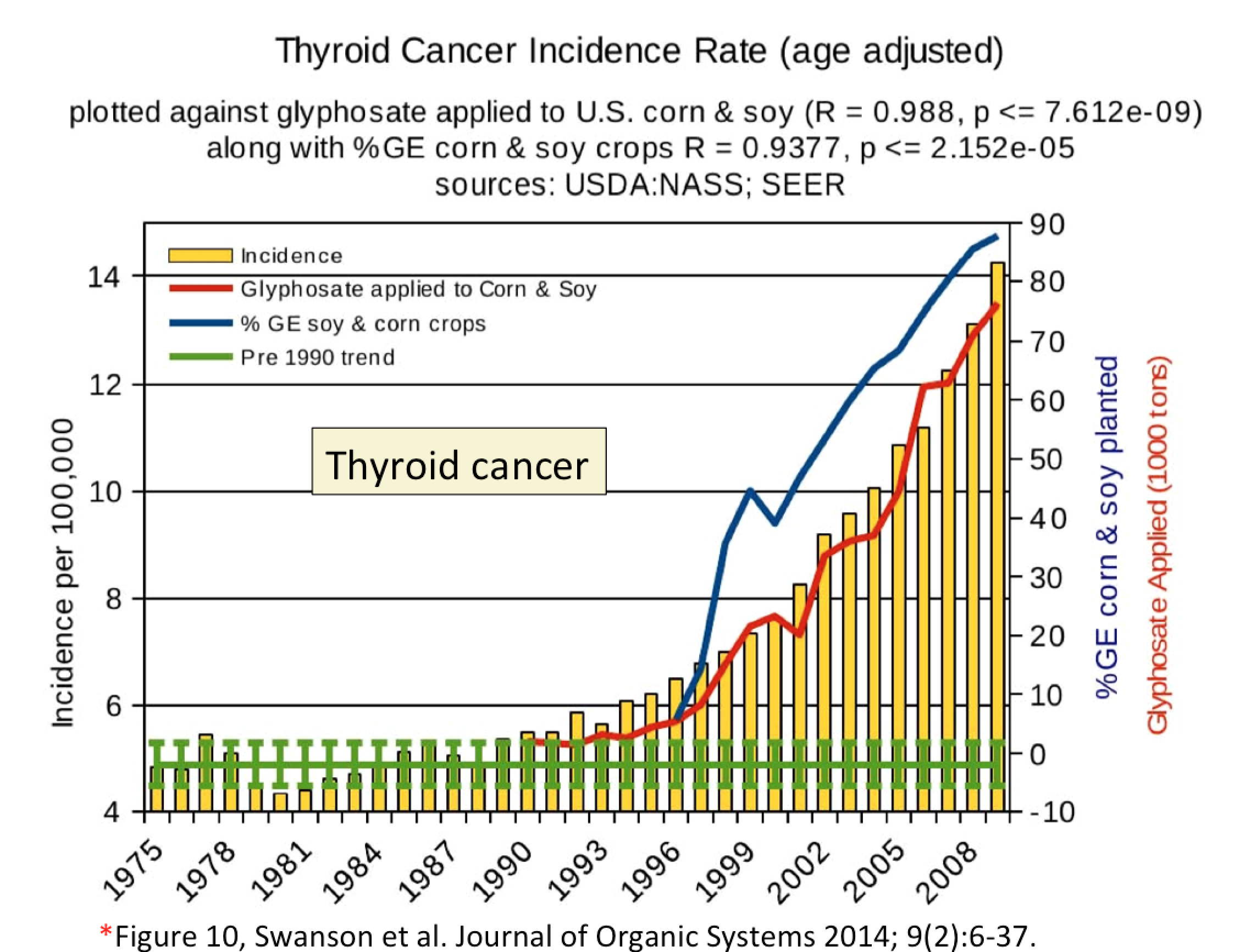
Now, exposure to Roundup may well have serious health consequences, but whatever they may be this particular graph is not persuasive. First of all, there's the obvious point that correlation is not causation. One would find a similar correlation between cell phone usage and hypertension, for example — or even between cell phone usage and Roundup usage! The authors make no causal claims, but we fail to see the value in fishing for correlations. Nor is looking at the magnitude of correlation coefficients necessarily a good way of measuring relationships among variables.
But our main point of including this figure here is to make note of what is going on with the axes. The axis at left, corresponding to the bar chart, doesn't go to zero. We've already noted why this is problematic. But it gets worse. Both the scale and the intercept of the other vertical axis, at right, have been adjusted so that the red curve traces the peaks of the yellow bars. Most remarkably, to make the curves do this, the axis has to go all the way to negative 10 percent GE corn planted and negative 10,000 tons glyphosate used! We've noted that the y-axis need not go to zero, but if it goes to a negative value for a quantity (percentage or tonnage) that can only take on positive values, this should set off alarm bells. (Connoisseurs of this sort of thing will find that the paper from which this figure has been drawn contains treasure trove of similarly problematic graphs.)
An axis should not change scales midstream
The graph reproduced below from World Inequity Report 2018 illustrates the growth in real income from 1980-2016 for the combined populations of China, India, US-Canada, and Western Europe. The purpose of the graph is to indicate where in the wealth distribution most of the growth occurred. The horizontal axis starts out on a linear scale: every 10% of the population is represented by the same distance along the axis. But once the graph reaches 99%, this changes abruptly to a logarithmic scale, in which smaller and smaller segments of the population take up equal size along the horizontal axis. At the far right side of the graph, we have a segment of the population corresponding to less than 0.001% of the population corresponding to a region the same size as used to represent the 10% of the population across the majority of the graph.
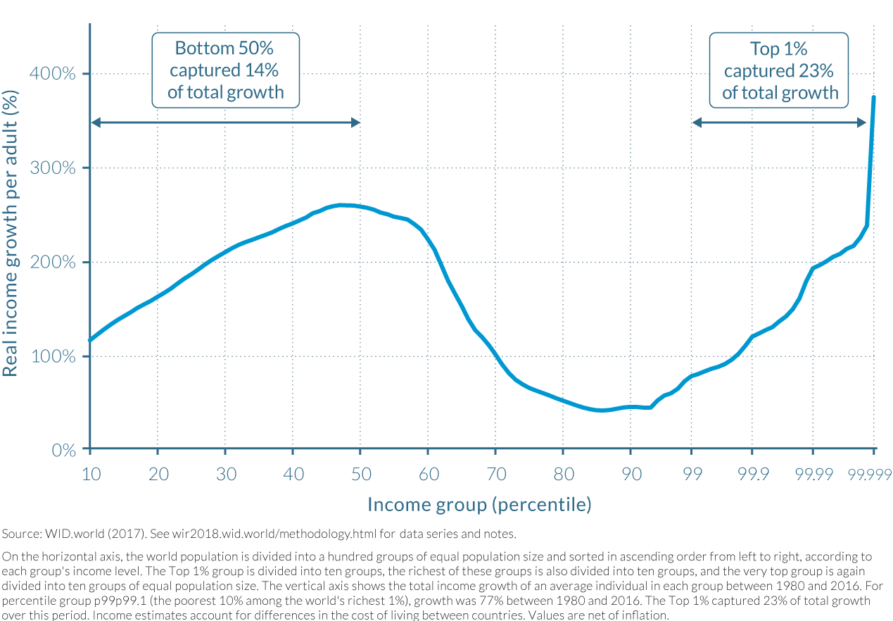
The obvious problem with this approach is that it creates the impression that the high growth among top income brackets is broadly spread across the wealthier fraction of the population. This is misleading; the top 1% of the population takes up three quarters as much space along the horizontal axis as does the bottom 50% of the population. If the graph were plotted on a linear scale throughout, we would see relatively modest growth in income across the right-hand side of the graph, culminating in a sharp "hockey stick" increase in growth for a very tiny fraction of the represented population.
Though logarithmic scales offer some challenges when using filled charts such as bar charts, we are not generally opposed to the use of logarithmic scales, particularly in technical documents such as scientific papers. They are too useful to dispense with. That said, switching axis types along the run of a single axis, as in the example above, seemes hopelessly misleading and should be avoided in all cases.
An axis should have something on it
We would have thought this obvious, but a line graph should have something numerical on each axis. The graph below does not. Its vertical axis is labeled "Language" but even in the most generous interpretation this is a categorical variable and thus not appropriate for display using a line graph.
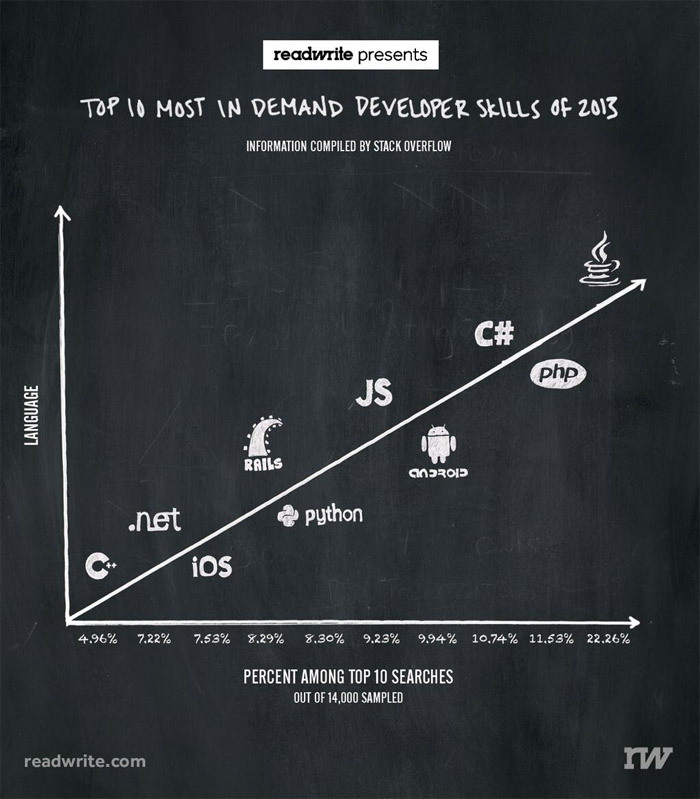
This graph isn't so much misleading as it is just plain perplexing. Max Woolf does a nice job of discussing its design flaws and suggesting appropriate alternative ways to present the same information.
Saving the worst for last?
In the graph below, via these these sources, the designer has inverted the vertical axis. For us and everyone we've talked to, this creates the immediate visual impression that gun deaths declined sharply after stand-your-ground legislation was enacted in Florida.
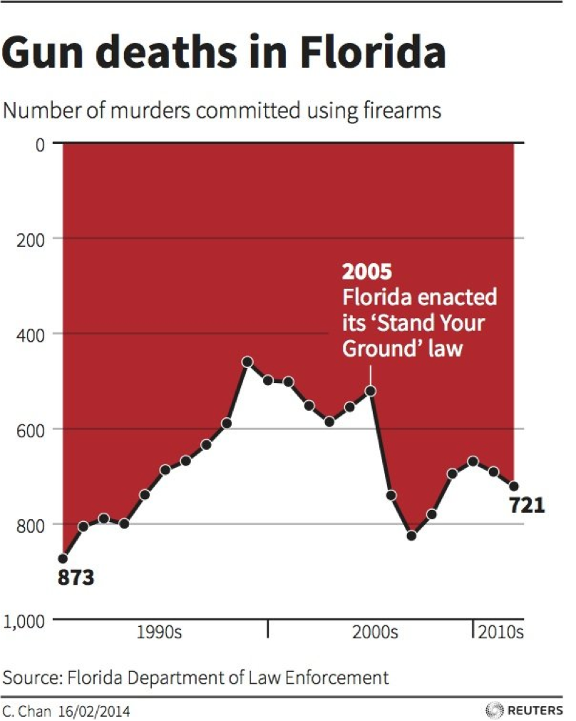
Of course this decline is an illusion. Gun deaths actually increased by about 50% in the subsequent two years. But because the axis has been inverted, due to the prominent text label on the year 2005, and because of the darker-toned red shading that makes the white below look like a foreground fill, this graph leads the viewer to believe that stand your ground made Florida a safer place to live.
To be fair, the artist does not appear to have intended the graph to be deceptive. Her view was that deaths are negative things, and should be represented as such. The website Visualising Data provides an interesting exploration of this issue and a spirited defense of the graph.
Conclusion
In summary, data visualizations tell stories. Relatively subtle choices, such as the range of the axes in a bar chart or line graph, can have a big impact on the story that a figure tells. When you look at data graphics, you want to ask yourself whether the graph has been designed to tell a story that accurately reflects the underlying data, or whether it has been designed to tell a story more closely aligned with what the designer would like you to believe.